Whenever I take a photo, I would use the Auto Tune, Auto Contrast and Auto Color functions in Photoshop to make the image looks better.
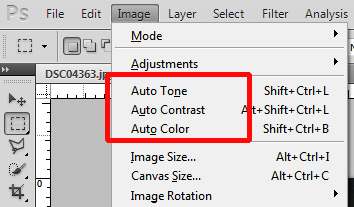
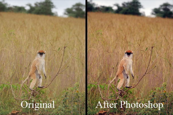
However, lately, I realize that the auto level might not make my pictures look better. Here are some original photos and compare with how they like after Photoshop. I like the original ones better. The color is more warm and vivid.
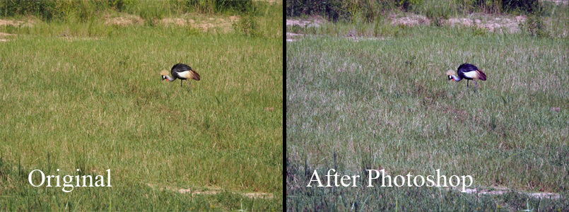
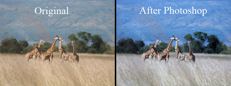
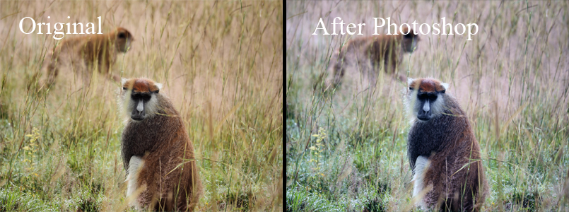
This goes to show that we can’t just automate this process. I still need to use my own eyes to judge what is good.
However, this doesn’t mean that Photoshop cannot make your picture looks better. Here’s an example of how the image looks a lot vivid after Auto Tune, Auto Contrast and Auto Color. I do wish I can automate this but I think it is best to test each photo to make sure the ‘automatic’ process in Photoshop is enhancing the picture.


3 Responses
Heya Cliff!
Just finished cleaning the 2400+ junk mails in my emailbox last night. Will write normally … uh… tmrw. Got a Bible Study this evening 🙂
Auto-Contrast, Auto-Color, Auto-Tone… don’t bother with them. The computer doesn’t know when there’s a color cast in the image that you want and will remove it. The grassy color from the savannah gives everything a yellowish hue. It’s supposed to. But the computer doesn’t know that. It takes it right out.
You may want this when you take a photo indoors under incandescent light, which makes everything orangey. But you don’t want this when you take a photo at sunset, which also makes everything orangey.
Only you can tell when the hue in the image is desirable or not.
So… don’t use auto-X in Photoshop.
Just go to Curves … I think it’s under Edit -> Curves.
You’ll see a graph there, which is technically called a histogram. It graphs out how many pixels you have in terms of brightness from pure black (on the left) to pure white (on the right).
To make the contrast in your image “pop”…
1. Drag the left triangle (“black-point”) to the right until you just hit where the curve starts going up from the X-axis.
2. Drag the right triangle (“white-point”) to the left until you hit the right-most part of the curve that leaves the X-axis.
3. Click on the diagonal line (the one running from lower left to upper right) about 1/3 from the left… and pull it down a bit. This will darken your darks.
4. Click on the diagonal line about 1/3 from the right… and pull it up a bit. This will brighten your brights.
Steps 1 and 2 define your absolute blacks and whites. Steps 3 and 4 together will turn the curve into a bit of an S-shape, and you can manually adjust how you want your image to look.
Once you get the hang of this, it takes about 5 seconds per image.
In terms of color cast… if there’s something there that you *don’t* want…
There’s a pull-down box just over the histogram. Change that to R, G, or B and adjust how much of each primary color is present in the image. Drag down the colored diagonal line towards the left or the right depending on whether you want to clear up your darks, mids, or brights.
Curves is single-handedly the most useful tool in Photoshop.
Hi Len,
Thanks dude. I do use curves but sparingly. I will follow your insutruction and see if that helps 🙂 Originally I wanted to create an automated script so I can process my images automatically. But I guess from my exp, I still need to one image at a time 🙂
Cliff
If you have a whole series of shots that need the same adjustment – like when you are in one place and your camera settings are the same for a number of shots in a row – there is a fast way to do it.
Well, the first one of the series you do the curves manually.
THen for every other one, just drag (and therefore copy) the curves adjustment layer from the first one onto it.
This way you can spend the time to get your curve just right for the first one and duplicate the adjustment curve for everything else in the series.
Doesn’t help if your shots are all exposed differently in different light, different locations, different whatever though 🙂